Anatomy of a Logo
We’ve been hard at work creating a new logo for Homeschool Connections. I have found the process to be fascinating. In fact, I even found a way to fit it into our homeschool studies.
We were studying heraldry in our Middle Ages history co-op. Each student was assigned to create their own coat of arms. We talked about how one’s coat of arms represented the person or family and how each symbol and every color has some special meaning.
Then the conversation moved to how modern company logos are similar to medieval coats. Here are a few examples of logos with special and hidden meanings:
 |
| Notice how the arrow denotes A to Z? |
 |
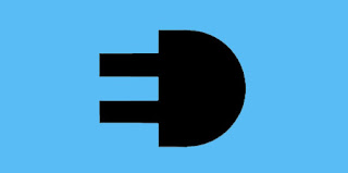
| This is an electric company. See how the E and D make a plug? |
 |
| In this one the G is also a happy face. |
 |
|
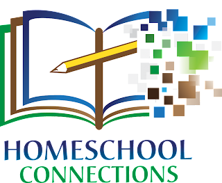
| And, finally, our new logo. The pencil and the book binding make a cross to represent our Catholicity. And the digitization represents the old becoming new. |
I hope you like our new logo. It’s so new, you won’t even see it on the website for a while yet. We’re in the midst of a complete website redesign built around the new logo. We’re also working to make the website more user friendly for you.
To see more cool logos, visit Toxel Design here and here and here.


